How the Railways Promoted Their Services

A Midland Railway poster lauding the attractions of Blackpool.
ADVERTISING and publicity material put out by railways makes interesting material for studies from several angles - the development of technique in the art of printing; appreciation of art and in particular of the art of typography; and, rather slowly, realisation of what makes effective appeal. There are many facets; posters, pamphlets, brochures, book marks, lantern slides, full-scale books, and cine film have all had attention. This aspect of railway work may be divided into three: factual information about the services offered - and over considerable periods, of the services not offered; prestige and development publicity; and use of the railway to advertise other people’s wares.
On the factual information side, the railways followed the tradition of stagecoach proprietors and canal companies which had established a style of combining timetables with slogans indicating their superior charms. One reads thus: “CHEAP travelling from the King’s Arms and Commercial Inns, Kendal; coaches leave the above inns every morning at SIX o’clock through Lancaster and Preston to Liverpool and Manchester in 9 hours certain at very reduced fares. NB - Passengers travelling by these Coaches arrive in Liverpool in time for the Steam Packet to Dublin and in Manchester in time for coaches to London in 22 hours, being only one night out on the road.” The date is 1833 and apart from numerous changes of type size and heavy underscorings of the salient points, there are half-a-dozen type faces used, including Ultra Bodoni, which was hailed by the advertising profession as the very latest in quite recent years.
By contrast canal notices about facilities, thefts of goods and the like were usually much more restrained in choice of type and thus much more effective. Curiously, many late nineteenth-century canal announcements were in the form this century has conditioned us to expect in the way of Russian deviationists’ confessions; in 1886 the Lancaster Canal published “a Public Apology” from an unfortunate boatman who had wasted water at a lock and again, “a Submission”, from three boys aged 15 and 12 who “having been caught bathing in the Preston and Lancaster Canal and being threatened with Prosecution, do agree to make this Public Submission, pay all expenses, and Promise not to offend again, in consequence of Legal Proceedings being stayed.”
T he printing of the Surrey Iron Railway’s toll sheet at its opening in 1804 showed not only that the direction of the world’s first public railway understood per-ton-mile statistics but that the benefit of using few sizes of type and of minimising the distraction of wildly varying styles of type was accepted.
Both typographically and in spirit, the Stockton & Darlington Railway’s handbill of September 19, 1825, announcing the order of proceedings on its opening day, six days hence, was a very modern looking document, which could have set a precedent, but unfortunately does not appear to have projected its influence very far ahead. The Liverpool and Manchester issued a combined rail and coach time-table in 1831, but the bill setting out the time-table in 1835 under the heading “Travelling by the Liverpool and Manchester Railway” showed nine trains, of which four were first class and five second class, in each direction on weekdays, with variations on Tuesdays and Saturdays; there were four trains on Sundays. The traveller had to guess whether times were am or pm. The fares table included charges for four-wheeled and two-wheeled carriages and included the tariff for horses; one at 10 shillings, two at 18 shillings the pair and the bargain rate for a three-horse customer of 22 shillings. The utilitarian message was driven home in utilitarian print.
With the Railway Mania and keen competition for public patronage, a sort of Dark Age of this type of public advertisement was entered, put out either by the railways, sponsors of excursions or the rival organisers of fly-boats who tried to persuade would-be patrons of the rapidity of their services. All were terribly cluttered up with information. A “grand railway trip to Liverpool”, organised by the Independent Order of Odd Fellows in 1842 in aid of a “Widows’ and Orphans’ Institution” has 19 lines of assorted type and despite being ostensibly an excursion starting at crack of dawn on a Monday and returning on Wednesday evening, gives only the second-class single ticket price from Birmingham.
Another, replete with detail of an excursion to Hull on a Sunday produced a caricature notice from Sabbatarian interests stating that the participants in such an un-Godly proceeding would be “hauled to Hell”. At that time a great many railways either did not work on Sunday or did not start trains between 10.00 and 16.00 hours on that day. Even into modern times churches near the Bow depot of the North London were stiff at Matins with North London enginemen and supervisors who were not booked for duty during the Sunday morning church interval.
 Keeping to the factual style of information, the Great Eastern in 1887 pioneered with a list of seaside and country hotels and furnished lodgings; the idea seems to have spread rapidly, but most imitators found it impossible to refrain from using some longwinded all-embracing title, such as List of Lodgings at Seaside and Holiday Resorts, amid Hill and Dale in Wild Wales on the Cambrian Railways. After reading the front cover the eager holidaymaker was probably too out-of-breath and exhausted to open the book. The Great Eastern holiday list had a briefer title, but it was overlaid by three disparate holiday scenes, one on top of the other, surmounted by the company’s coat-of-arms. The Midland and the South Eastern & Chatham guides had the date on the cover, thus preventing the unsuspecting user from writing letters fruitlessly to someone who had gone out of business; the Vale of Glamorgan and Barry Railways issued a booklet under the simple title Holiday Haunts. A typical piece of railway propaganda at the turn of the century period was the London & North Western brochure to publicise its new route to Buxton: Dovedale as it will be seen from the North Western Company’s New Railway from Buxton to Ashbourne.
The title page of George Measom’s Official Illustrated Guide to the South-Eastern Railway and All its Branches, published by W. H. Smith and Son.
The spate of railway publications seems to have put a term on the privately published guides to railway scenery. There were series by George Measom, published by W. H. Smith & Son, imitated in the eighteen-seventies by Guides to the Great Railways of England by Morton & Company and, in the next decade, the more limited series by Cassell. For the most part they were worthy but dull publications listing the delights of the countryside about railway routes; we had to wait until this century was well advanced for books of the calibre of The Euston to Crewe Companion. In those halcyon days the printing of the railway-produced guides publicising resorts and the holiday accommodation available cost an estimated 1 shilling each in modern terms and about three million of them were sold for something under 1 penny; a similar loss was made on the publicising of services in the timetables, issued two or more times a year in some cases, and another costly source of publicity was the issue of series of postcards of railway engines, trains and ships - a business that was in all probability also handled at less than cost.
The development of printing processes so that coloured lithography on a large scale became possible produced the pictorial poster, however. The lush period of development was between 1895 and 1914 and in those years attempts were made to push practically every aspect of railway, trading as far as passengers were concerned. On the freight side, the illusion of monopoly still remained with railway managements well into the lorry age. At the beginning of this century the modest-sized Lancashire & Yorkshire Railway was spending about £7,000 a year on poster printing. The railways did not appear to use outside poster sites to any extent, so that at that time they were preaching to the converted who were already on railway premises for some purpose.
 Artist W. Gunn Gwennet, commenting in an article on railway posters in The Railway Magazine in 1900, thought the railways did not get value for money from their posters, partly because too many relied on bald announcements in type and largely because the pictures in the others were inferior as works of art. Not only should the picture used be considered for its quality as a work of art, but it should be both bold and simple; to be well-drawn was vital. A W. Gunn Gwennet drawing of a girl sitting on a trunk in a railway station was used by the London, Brighton & South Coast Railway as an advertisement for Bexhill-on-Sea. Neither picture nor text conjured up a vision of the sea or Sussex and a clutter of type on one side referred to times of trains and on the other to the fact that a new and luxurious hotel on the sea front was now open.
Tanconville’s “Cannes” poster, produced for the PLM.
This failure to tell a simple story long dogged the British railway poster. By contrast Tanconville (Henry Ganier) did one for the PLM which had the one word “Cannes” at the top of a seductive view of the Mediterranean coast. PLM added its initials in a minor key on the other side and some circular tour particulars appeared at bottom left, partially obscured by a fishing net on the beach. This could have been improved by omitting all the details of cheap facilities, which were in next-to-unread-able print anyway. “Monaco”, by Hugo d’Alesi, also for the PLM, was not so effective because of an inset view of Thermes Valentia surrounded by roses and some messy printing in five styles in six lines which told one about sea bathing, summer and winter, return tickets, circular tour tickets and reduced rates for families. The idea of using established artists was slow to grow with railway publicity committees in Britain.
A typical poster issued by a railway in 1903 was the Cheshire Lines “Summer Holidays in the Isle of Man” effort; name of railway and title was draped across the poster under the Cheshire Lines Committee’s badge in type that looked as if the draughtsman had made it up as he went along. A map showed the Isle of Man and the Lancashire coast, with Lancashire firmly occupied by the three-legged arms of Man. Scrolls carried the legend “The popular express route via Liverpool” with “Double service” adrift between their folds. A jumble of prominent lettering imparted the information “to Douglas and Ramsey for 1 day, weekend, 11 days and tourists’ tickets for 2 months”, set out on nine different levels. There were 16 other lines of information, the name of the manager, the location of his office and that crowning stupidity “For full particulars see small bills”.

Cheshire Lines poster advertising summer holidays in the Isle of Man.
A Blackpool and the Lakes excursion was advertised by the Furness Railway and had the merit that most of the type was at least in level readable lines. Two girls on a ship’s deck sharpened a reference to the fast steamer Lady Margaret and the paddle steamer Lady Evelyn. A London & South Western poster of the period advertised the London to Paris service via Southampton and Havre with four vignettes of scenes and wording worked into the loops and whorls surrounding them; another example of cramming, although not so tasteless, was a Midland & South Western Junction double-crown spread about “Cheltenham The Garden Town” which included four scenes, nine lines of commendation and two lines advising the potential customers to look at the company’s timetables and notices. The North Staffordshire Railway, another example of a small railway with a lot to say, claimed to afford “tourists, excursionists, pleasure and picnic parties access to the following places celebrated for scenery of Rock, Wood, Water and Dale” and this wordy introduction was followed by 15 names, six pictures and a map as well as a commendation of “Stoke-on-Trent and the Neighbouring Pottery Towns” and four other lines of information including the admonition to “see Company’s Time Tables”. More sense was shown by the North Eastern with the one-word heading “Northumbria” to a splendid painting of Bamburgh Castle and a left-hand strip of the arms of seven towns in Northumberland. The twenty words of large text called attention to castles, coast and Roman wall.
First signs of intelligent display came from the Great Eastern and Great Northern Railways. Against a vivid sketch of a wherry and a windmill the Great Eastern just declaimed “Norfolk Broads - Direct Route from Liverpool Street and St Pancras”. In 1904 the Great Northern, which had issued a long poster of an East Coast train much admired by railway enthusiasts in 1903, reduced the minimal wording of that to “Great Northern Railway” on a picture of a child paddling in the waves with sister and mother; but management was unable to resist adding “For particulars of tourist, week-end and other cheap tickets, apply at any Great Northern station or town office”. Simplicity was soon to win a greater victory at King’s Cross with John Hassall’s cartoon of a boatman skipping on the beach and the one slogan “Skegness is so Bracing”.
The Midland Railway’s advertisement of tourist resorts in the Peak of Derbyshire carried five scenes but otherwise resembled a page from a photographic album of the period. It fell to the Midland’s rival, the London & North Western, to make a breakthrough, using Norman Wilkinson seascapes, the railway’s name and some simple wording such as “Dublin and Holyhead”. There were plenty of relapses - such as the Greenore route poster with 13 lines of print, five of which were going in and out like a ‘Varsity eight, and a picture of Carlingford Lough. The poster of the Euston and Birmingham two-hour service with eight similar locomotives under eight clock faces showing the times of the principal trains each way and a mass of other information was only equalled for confusion by the 1905 wall calendar which surrounded a picture and the date pad with one-word-one-line messages “Royal Mail Route to and from Scotland, Wales and Ireland” and “Shortest Quickest & Most Comfortable Route Between London, Birmingham Liverpool Manchester & Glasgow” and each slogan was interrupted by a strip referring to the Fleet Street (Bolt-in-Tun) office. Later the LNWR standard posters contained limited phrases about the places they advertised on a pictorial background and uniform lettering gave them common purpose.

One of the famous LMS advertisements commissioned from noted academicians, namely “Speed” by Sir Bertram Mackennal.
The leaven of better design spread very slowly. On the way the Lancashire & Yorkshire called attention to through services and facilities to the South Coast with the words “From the gloom of the town to the sunny South Coast” perched between a view of smoking chimneys set in semi-darkness and a sunlit map of the English Channel resorts from Folkestone to Torquay. The North Eastern did well with a series with simple wording, such as “Teesdale Yorkshire” over a picture of High Force and a border with a rucksack design, but could not omit a mass of wording to give the passenger manager’s address and a quotation from Sir Walter Scott.
Frank Pick was responsible for much of the uplift in artistic standards on railway poster design. In 1908 he persuaded John Hassall to make a cartoon of “No need to ask a p’liceman”, in which the police constable is referring inquirers from the country to the map then exhibited outside all London Underground stations, whether they were in the Underground group or not. Then there was Mabel Lucie Attwell’s charming sketch of two kiddies interviewing a rabbit at one of the country resorts on the District Railway - “Hello, did you come by Underground?” Pick employed top rank artists - Frank Brangwyn, Edward McKnight Kauffer, Rex Whistler, Jacob Epstein, Dame Laura Knight - and made the most of their work. By 1915 he had engaged Edward Johnston, the leading lettering artist of the day, to design the Johnston type face still used by London Transport; it brought about a renaissance in the work of type design and was followed by Johnston’s friend Eric Gill designing his well-proportioned typeface specially for the London & North Eastern Railway a decade later.
By that time it seemed imperative for railways to do their best in good clean quality poster design and it spread to all their literature and publicity efforts. Under the influence of J. B. (later Sir John) Elliot, the Southern achieved the standard of simple direct messages such as “South for Sunshine” above a picture of a small boy talking to the driver of a King Arthur 4-6-0 at Waterloo. The naming of the locomotives much employed on the competitive services to Devon and Cornwall after characters from Arthurian legend was in itself a master stroke of publicity. The rival Great Western, its reputation secured with the general public by the remarkable series of glamour books by W. G. Chapman, was in the van with modern poster design; in 1933, for example GWR Air Services produced an excellent one with an aircraft, a map of the Birmingham-Plymouth route, the company’s monogram and five lines of typographically excellent names of places served. The advance over the Great Western’s rather crude comparison of the Cornish and Italian Rivieras on enamelled plate was notable, but then so was the advance in LMS publicity (with considerable use of work by Academicians) and that of the LNER, where Gill type was a distinguishing feature of the surrounding letterpress.
O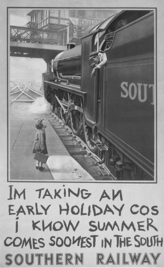 ne important factor in the selection of good poster designs was the part played by many resorts, which took advantage of being able to pay for publicity material out of the rates, and joined forces with the railways. Until 1911 only Blackpool had the power to spend ratepayers’ money on attracting holidaymakers from outside the borough - and they even supported a shop in High Holborn, London, where the virtues of holidays on the Fylde Coast were extolled.
What John Elliott described as “the most effective poster that we [the Southern] or any other railway produced at that time”. It shows Ronald Witt looking up at fireman Woof of Nine Elms. Since it first appeared, it has been reproduced over and over again.
As to the third arm of publicity on railway premises, that used by purveyors of commercial products, in the early years of the century it was in bad odour. Although many firms kept their advertising on railway stations to short messages such as “Bovril”, or “The Pickwick, the Owl and the Waverley Pen; They come as a boon and a blessing to men”, some stations were so plastered with overlapping notices that it was difficult, complained a District Railway traveller, to “tell whether one was at Victoria, Virol or Vinolia”. (Twenty years later most of the stations on the Northern Railway of France had a board proclaiming URINOIR on a platform building much more prominent than the station name.) The Underground in London began a mighty clean-up after electrification and soon not only established its own lead in devising posters but pushed the Metropolitan into some delightful examples, such as the track scene beyond Rickmansworth, merely labelled “The Gateway to the Chilterns”.
Other railways followed the London examples and an orderly plan was evolved by the trade advertising agent of the North Eastern, a former colleague of London’s Frank Pick, in 1911. Under the scheme, the spaces for commercial posters and those of the railway were set out neatly on every station on the line; all spaces were numbered and registered so that there could be no doubt where a poster should be displayed, the filling and charging of the spaces were simplified and clashes between rival products could be avoided. In the meantime the advertising industry had done as much for commercial advertisers in improving the technique of poster design and printing as had been done on the railways; at last the poster began to come into its own as a necessary means of transmitting information and instigating thought rather than a disorderly attempt to catch the passing eye.
You can read more on “Railways and Postage Stamps”, “The Railway Centenary Celebrations” and “Railways in Art” on this website.